
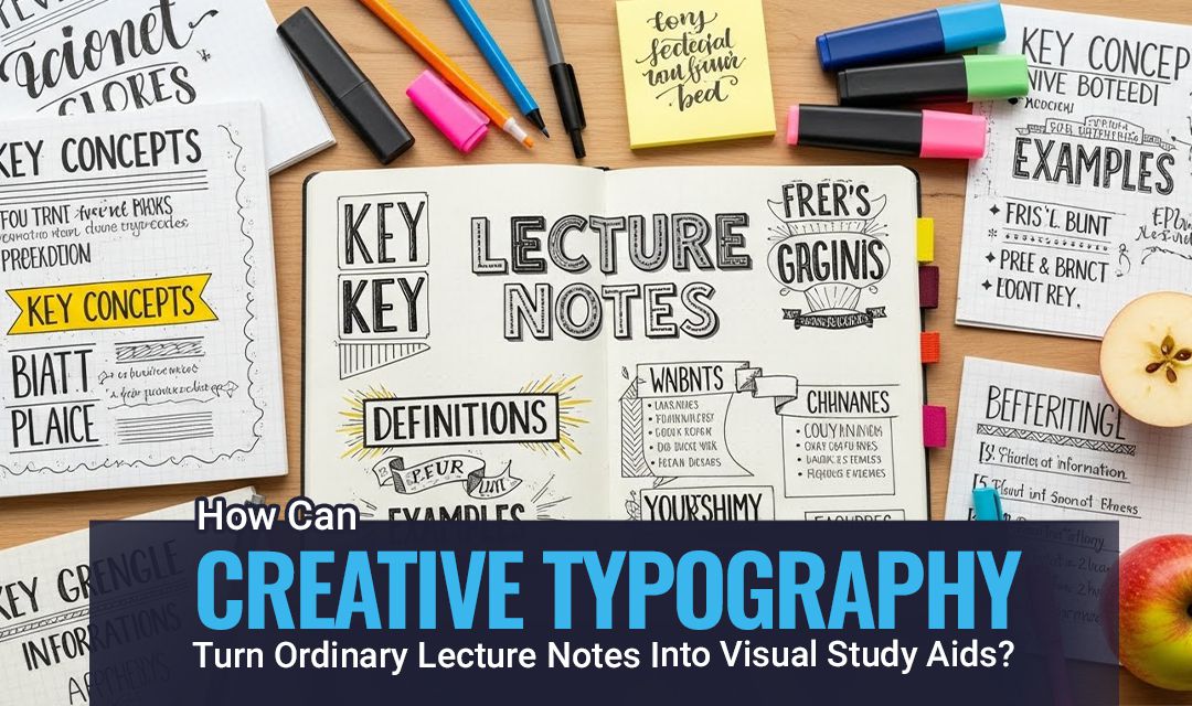
How can you make your lecture notes easier to remember and more visually clear? Many students face the same problem when notes are written as long and dense blocks that are difficult to remember. However, creative typography can change that.
By using clear structure and visual cues you can turn ordinary notes into study aids that make learning easier. Typography is not just decoration; it highlights important ideas and improves the flow of information. In this article, we will explore practical ways to transform your notes into effective visual study tools through creative typography.
Key Lessons
- Creative typographic innovation emphasises key points and transforms simple notes into visual signposts.
- The ideas of creative typography design improve readability and make study material more interesting.
- Experimental typography in graphic design contributes to different shapes and styles that aid rapid recall.
- Modern creative typography trends encourage new layouts that help people understand complicated matters more easily.
- Creative typography improves memory by transforming text into images that students can review quickly.
5 Ways to Turn Your Ordinary Lecture Notes into Visual Study Aids Through Creative Typography
Simple lecture notes can be transformed into captivating visuals by using creative typography. It helps the students understand the complex points faster through a clear and organised text design.
Let’s discuss the top five ways creative typography turns ordinary lecture notes into visual study aids.
1. Use Hierarchy to Create Structure
Hierarchy plays an important role in effective note design because it organises ideas in a clear order. When someone looks at the page, they first notice the structure before anything else. A strong hierarchy helps you see where a topic begins, how it develops and where it ends. This way makes the learning process smoother and prevents your notes from feeling like a continuous block of text.
For students working on major academic projects like dissertations, understanding hierarchy is very important. It shows you how to organise your ideas and present them clearly. If arranging your research and thoughts feels difficult, a trustworthy dissertation writing service such as The Academic Papers UK can help. They guide you step by step so that each part of your academic papers flows logically. This makes writing easier and improves the overall quality of your work.
How Do Headers and Titles Guide Your Eyes?
Headers act like landmarks in your creative typography. An H1 shows the main area of a topic. The H2 shows an important section within that area. A short title highlights a specific detail or point. When used regularly, these components make it easy for your eyes to move through the content. In such a way, your brain never feels lost because you can instantly see how one idea connects to the next.
Why Does Hierarchy Strengthen Understanding?
Hierarchy provides answers to important learning questions. You see the main idea and understand how it breaks into smaller parts. You also identify which kind of details fall under each category. A ResearchGatestudy found that students who used structured headings recalled the key concepts more accurately because their brains formed clearer mental maps.
2. Use Bold Text and Colour to Mark Key Concepts
Use bold text; colour plays a powerful role in creative typography. Bold text and colour are effective tools that show you important information and direct your attention immediately. They act as visual signals on the page telling you to focus on key ideas. When you use it with care, it transforms the simple notes into organised materials that support rapid and confident revision.
How Does Bold Text Support Instant Recognition?
Bold text helps highlight key elements, such as formulas and important results. It works on the Find Me principle which means your eyes quickly notice bold items when scanning the page. This approach lets you identify important details without reading every line.
Using bold strategically also improves memory retention because your brain links visual cues with important information. It saves time and makes reviewing complex content more effective by turning ordinary notes into tools that actively support learning.
How To Colour-Code Concepts or Diagrams?
Students can use different colour-coded concepts such as:
| Color | Suitable For |
| Blue | Scientific terms |
| Green | Dates |
| Red | Exceptions |
| Purple | Formulas |
| Yellow | Mechanism |
An NIH study reported that consistent colour coding improves your memory because it reinforces the associations between the visuals created during study sessions.
3. Use Spacing to Break Down Complex Ideas
In note design, spacing is a simple but effective tool for creative typography. When text is confined, your brain works harder to process the information. This situation leads to cognitive overload and slows the process of understanding. When you add space between the ideas, your mind feels relaxed and absorbs the information easily. Well-spaced notes feel lighter and far more inviting to read.
Why Does White Space Improve Learning?
White space is a functional part of the learning process. It creates breathing room for your eyes and separates the ideas into manageable parts.Attention Insights found that students who read text with an increased white space expressed stronger comprehension because their eyes moved through the content more smoothly.White space reduces strain and turns difficult concepts into clear, digestible information.
A formula becomes more noticeable when isolated with extra space above and below. Chemical pathways also benefit from spaced steps because each reaction becomes easier to follow. By using the proper spacing, complicated content transforms into clean and readable study materials.
4. Use Shapes and Text Blocks
Text blocks and shapes are considered important visual anchors for creative typography. They highlight the most important information by making your notes less disorganised and more professional. Using such components appropriately will help you in memorising important details in long texts without forgetting. Typography also helps in research design by providing a structured framework for clear and credible communication of information.
Text boxes are ideal for highlighting key formulas and warnings or processing steps. When these elements are placed inside shaded shapes or outlined areas, your eyes naturally land on them the first time. This structured focus supports faster recall and a clearer understanding. An MDPI study found that the students retained critical information better when it was placed inside the visually distinct blocks.
How To Design Shapes Without Clutter?
Use the light borders and the soft pastel fills to keep the shapes clear and easy on the eyes. Keep your text concise and avoid complex patterns or dark backgrounds that can distract your attention. Maintain a consistent style across all of your notes to create a smooth and transparent visual flow. This approach helps you to focus on the key information and makes your notes easier to review quickly.
5. Use Bullet Points and Numbering
The use of bullet points and numbering simplifies long explanations into structured lists that are easier to study. Instead of reading the lengthy paragraphs, you can read only the most important information on your topic of interest. The result is a better way of revising specific information that enhances better understanding and is more effective in recalling answers.
How Do Bullets and Numbering Simplify Content?
Bullets can also help to organise messy or repetitive texts during the creative typography. They highlight the most important ideas and enable your brain to scan the information quickly. Bullets also make it simple and easier to compare your concepts and identify the patterns within your specific topic.
Numbering is an ideal approach for processes that follow a specific order, such as experimental steps or reaction paths. Your brain remembers the sequences more effectively when each step is numbered clearly. This makes the complex tasks easier to follow and easier to revise.
Conclusion
You can give your lecture notes new life by using creative typography. It transforms boring texts into excellent educational resources that encourage critical thinking and help you learn. This goal can be achieved by organising the material so that each section has a heading that highlights important information. Increase the spacing to focus more on the valuable information. The use of shapes draws attention to key points, while bullet points make the content easier to understand.
You can create a reading study article that is easy to read and simple to update. These methods do not require any design expertise. Instead, they focus on making clear decisions and following a smooth learning process. For students and researchers, clear presentation improves understanding. Because of this, many use dissertation writing services in the UK to organise their work effectively. When combined with creative typography the content becomes easier to read and remember.
Frequently Asked Questions About Creative Typography
What Are the Main Creative Typography Trends in 2025?
Creative typography trends in 2025favour clean and bold designs.
- Designers use variable fonts and basic geometric shapes.
- Colour layering and texture softness are also popular.
These trends allow one to make the text both easy to read and visually interesting. Most designers use minimalistic construction with a modern twist. The goal is to make the type clean while also incorporating some artistry.
How is Creative Typography Used in Branding and Logos?
The use of creative typography allows a brand to be distinct in a very straightforward manner. Designers use enhanced letters with bold or low curves to express a brand’s personality. The use of clear type makes a logo memorable. Applying the right font to a brand can give it a modern or premium appearance. This helps customers quickly associate themselves with the brand.
What Are Some Examples of Creative Web Typography on Real Websites?
The majority of websites use a contemporary form to make the content easier to read.
- Fashion websites use large, clean text to give the site a fashionable appearance.
- Tech websites use simple, sharp fonts to give a modern look
- Creative portfolios with animation or flexible fonts showcase talent.
- Blogs have a soft, handwritten style that gives them a homely feel.